Why choosing the right fit matters
I was too mean to a student on LinkedIn this morning, and I owe him an apology. But the thing I was mean about matters - and it matters beyond one chart in one report. So here's the apology, the explanation, and an interactive tool you can use to see the problem for yourself.
What happened
[name redacted at OP's request], a master's student in Spatial, Transport, and Environmental Economics, shared two reports he'd coordinated at the UK Department for Transport on future aircraft fuel efficiency. They're substantial pieces of work (one with the Aerospace Technology Institute on fuel efficiency estimates for future aircraft types, the other with the Aviation Impact Accelerator on operational efficiencies) and both are now published on GOV.UK.
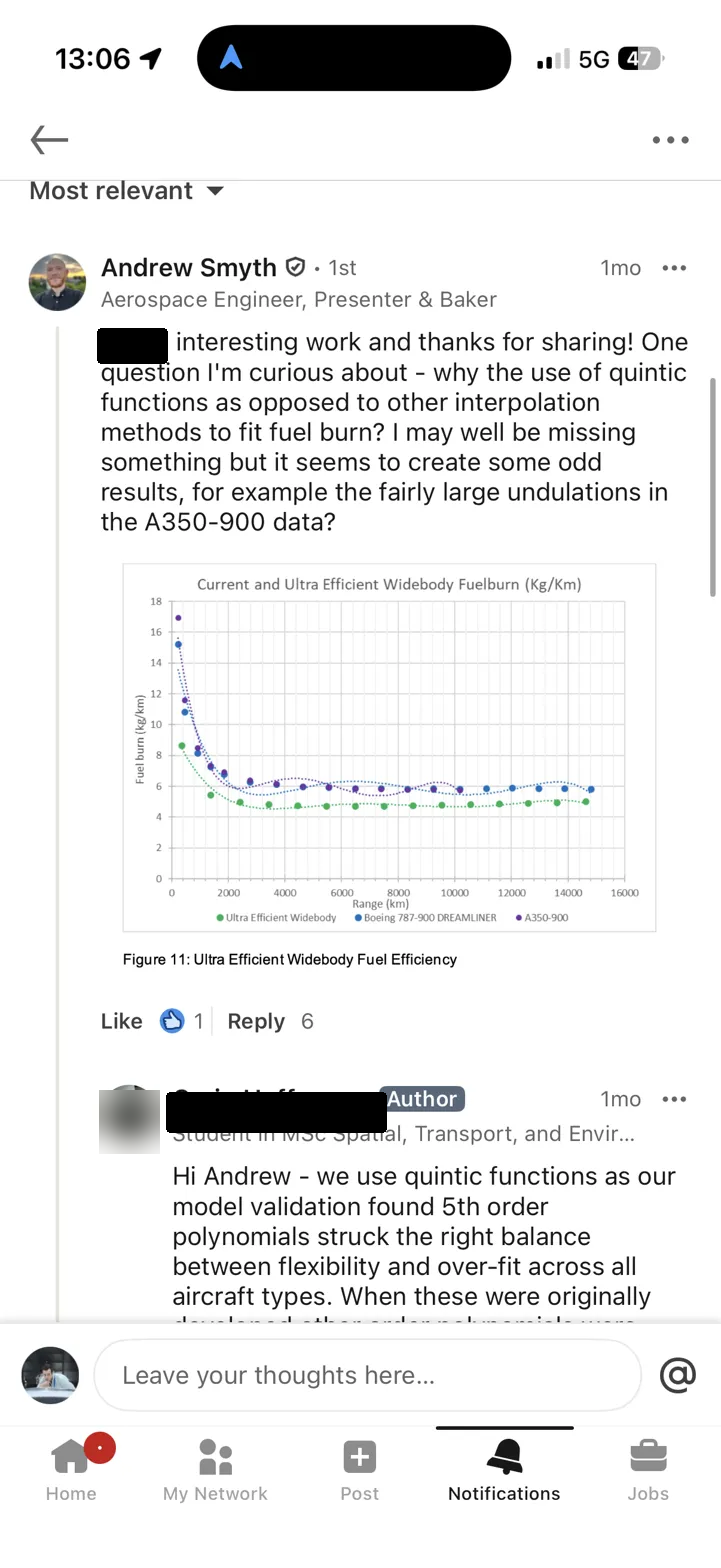
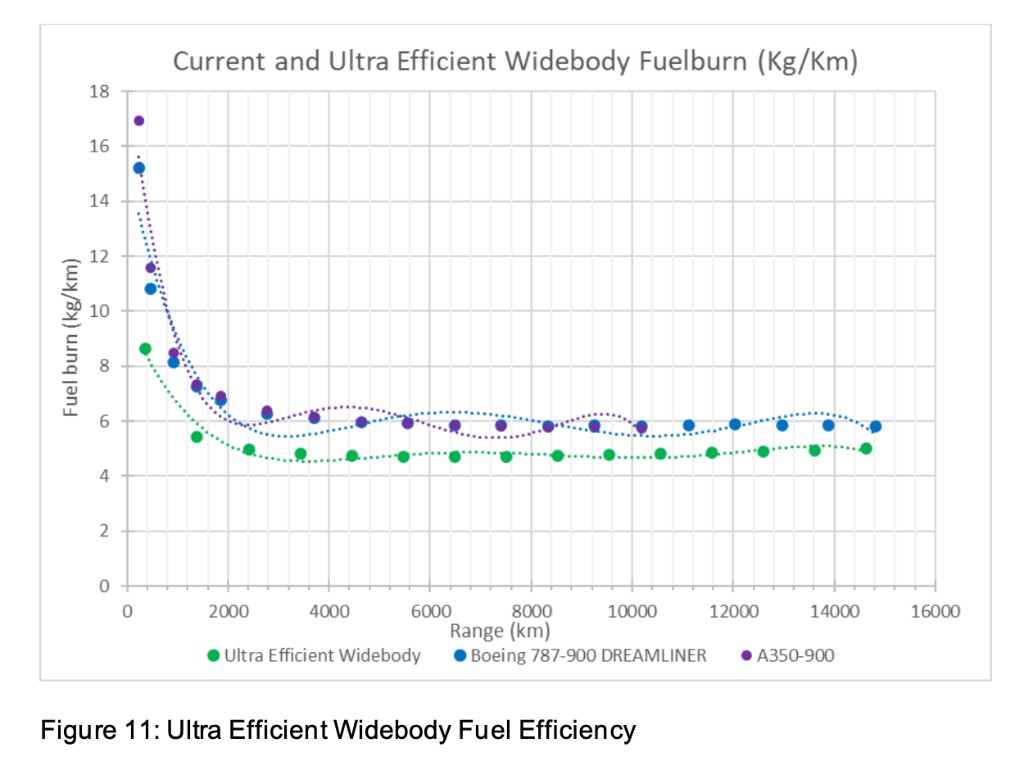
Andrew Smyth - aerospace engineer, Great British Bake Off finalist, and generally someone who knows what he's looking at - noticed something odd in the fuel burn plots. The curves fitted to fuel burn per kilometre versus range for widebody aircraft showed telltale undulations: oscillations that don't correspond to any physical process, the kind of artefact you get when you fit a high-order polynomial to data that doesn't want to be a polynomial.
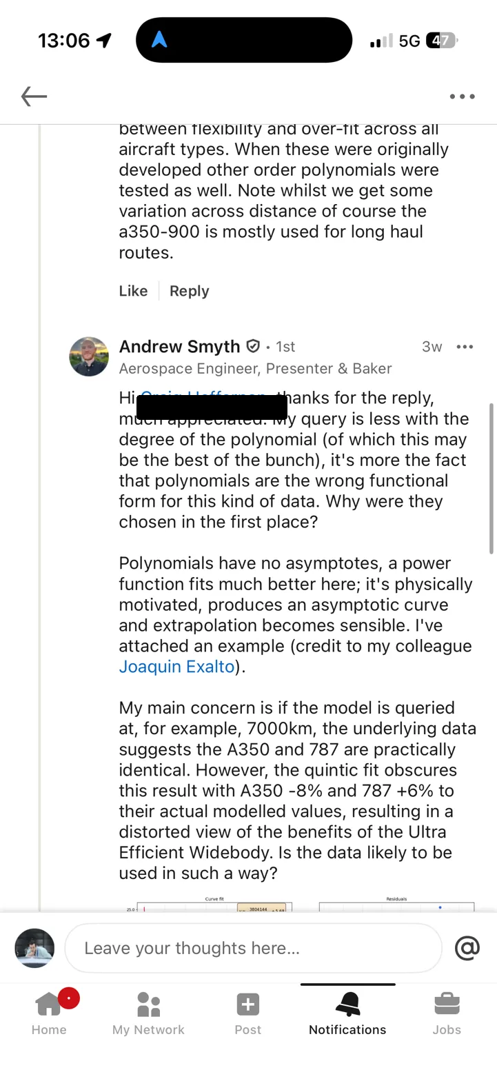
Andrew asked (politely) why quintic functions had been chosen over other interpolation methods. [name redacted at OP's request] replied that model validation had found 5th-order polynomials struck the right balance between flexibility and overfit. Andrew pushed back: polynomials are fundamentally the wrong functional form for this kind of data. A power function is physically motivated, extrapolates sensibly, and doesn't invent features that aren't there. He even attached a comparison plot from his colleague Joaquin Exalto.
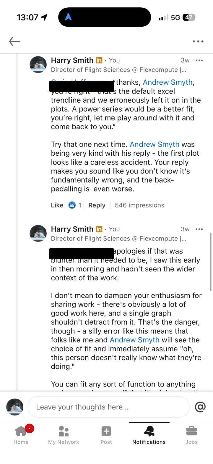
I then jumped in and said something along the lines of: your reply makes it sound like you don't know this is wrong, and the back-pedalling is even worse.
The technical point was fair. The way I made it was too blunt. [name redacted at OP's request] is a student sharing published work he's proud of, and I could've made the same point with more care. Sorry, [name redacted at OP's request].
But the underlying issue is worth unpacking properly, because this isn't really about one student or one chart. It's about a failure mode that's everywhere in engineering, and it's sitting in a government report that informs policy.
The physics of fuel burn vs range
Aircraft fuel burn per kilometre is not constant with range. On a short flight, you spend a big chunk of the mission climbing and burning fuel at high thrust settings. That fixed cost gets amortised over more kilometres as range increases, so fuel burn per km drops with distance. At very long range, the curve flattens - you're spending almost all of the mission in cruise, and the per-km cost approaches an asymptote (set by aerodynamic efficiency and engine SFC, basically).
This is a physical process with a clear functional form. It decays. It has an asymptote. It's monotonically decreasing (or near enough - step climbs and wind effects notwithstanding). The right family of functions to describe it is something like:
where , captures the magnitude of the short-range penalty, is the long-range asymptote, and is range. This is a power law with an offset. It decays, it flattens, it doesn't oscillate, and it extrapolates sensibly. It's physically motivated.
What a polynomial does instead
A 5th-order polynomial knows nothing about physics. It has six free parameters and will happily contort itself to minimise residuals within the data range (which is, let's be honest, exactly what Excel's trendline feature encourages you to do). For fuel burn data, it can produce a fit that looks tolerable on the page - the R-squared will be high, the curve will pass near the points, and if you don't look too carefully, you might think the job is done.
But there are three problems, and they range from subtle to catastrophic.
1. Spurious undulations in the data range. A quintic has up to four turning points. Fuel burn vs range should have zero (or at most one, in unusual cases). The polynomial will introduce wiggles that don't correspond to any real phenomenon, and these wiggles can distort comparisons between aircraft types. In the DfT data, Andrew pointed out that at around 7,000 km, the polynomial fits suggest the A350 and 787 have meaningfully different fuel burn - when the underlying data shows they're practically identical. The polynomial is manufacturing a distinction that doesn't exist.
2. Obscured convergence behaviour. At long range, widebody aircraft of similar technology levels converge to similar cruise efficiency. This is physically meaningful and policy-relevant: it tells you something about the diminishing returns of aerodynamic improvement at very long range. A power function captures this convergence naturally. A polynomial can obscure it entirely, because each aircraft's polynomial is independently free to undulate through the convergence region.
3. Catastrophic extrapolation. This is the showstopper. Extend a 5th-order polynomial beyond its fitted range and it will, inevitably, diverge. For these fuel burn curves, that means the fitted function will eventually predict zero fuel burn per kilometre, and then negative fuel burn. The aircraft, according to the polynomial, starts generating fuel. (Free energy! Somebody call the patent office.) This isn't a theoretical concern about edge cases - it happens within a modest extrapolation beyond the data range. I've built an interactive tool so you can see it for yourself.
See it for yourself
Below is the actual digitised data from the DfT report. Toggle between polynomial fits (orders 3, 4, and 5) and the power function. Pay attention to what happens beyond the dashed line marking the edge of the data range. The power function decays to its asymptote. The polynomial goes off a cliff.
Fit Results
Data digitised from DfT aviation fuel efficiency report · Fits computed via least-squares & Levenberg–Marquardt
A note on splines
After I posted this, Daniel Raymer - aircraft designer, author of Aircraft Design: A Conceptual Approach, and someone whose textbooks I suspect most of us have on a shelf somewhere - left a comment pointing me to Akima splines. I hadn't come across them before. So I've added both a standard cubic spline and an Akima spline to the tool above.
Splines are interpolation methods - they pass through every data point exactly, which means R² = 1 by definition. That's not a statement about how good they are; it's a statement about what they're doing. They're not fitting a model to data. They're drawing a smooth curve through known points.
This makes them excellent for a specific class of problem: when you have points that you know are exact (or close enough), you absolutely do not need to extrapolate, and you just want a smooth, faithful interpolation between them. Geometry shaping is the classic case - Raymer uses Akima splines in RDSwin for fuselage lofting, where the cross-section control points are design intent and you want the surface to honour them without inventing wiggles between them. The Akima variant is particularly good at this because it uses a weighted slope-averaging scheme that suppresses the overshoot you get with standard cubic splines near sharp changes in the data.
For the fuel burn problem, though, splines don't solve the underlying issue. Toggle them on in the tool and extend beyond the data range - you'll see that both splines extrapolate badly (the cubic spline spectacularly so). They also don't give you a compact functional form you can hand to someone else, and they can't separate signal from noise in data that has measurement uncertainty. For this particular problem, the power function is still the right answer. But it's good to have them in the toolbox, and I'm glad Raymer pointed me to Akima's work.
Why this matters
You could argue this is pedantic. The report isn't asking anyone to extrapolate beyond the data range. The polynomials fit the data adequately where the data exists. So why does the functional form matter?
Because of what happens downstream.
These reports feed into policy analysis. Someone - a civil servant, a consultant, a modeller building a fleet emissions tool - will use these curves. They'll either:
(a) use the fitted curves blindly, plug in range values that fall outside the fitted region, and get nonsensical results; or
(b) notice the fits are wrong, and lose trust in the entire body of work.
Neither is good. Option (a) produces bad analysis. Option (b) discredits good work - and the underlying data and research effort behind these reports is genuinely valuable. A poor choice of curve fit shouldn't be enough to undermine it, but in practice, it is. When an experienced engineer sees an Excel default trendline in a published government report, the first thought is not "I'm sure the rest of the methodology is rigorous." The first thought is "if they didn't catch this, what else did they miss?"
That reaction might be unfair. But it's real, it's predictable, and it's avoidable.
The deeper problem
Look, the instinct to fit a polynomial and move on is something most of us have had. It's the default in Excel. It's the first thing you reach for when you need a smooth curve through noisy data. And for many applications it's fine - polynomials are great interpolators within their fitted range, provided the data doesn't have strong physical constraints on its functional form.
But engineering data almost always has physical constraints. Fuel burn has an asymptote. Drag has a minimum. Lift curves have a slope set by geometry. When you know something about the physics, you should encode it in your choice of function. A polynomial doesn't encode anything - it's a universal approximator with no opinion about what the data is doing or why. (Which is exactly the problem.)
The fix for the DfT report is simple: refit with a power function. It'll take an afternoon. The fit will be better in-sample, the extrapolation will be physically meaningful, and nobody will look at the plots and wonder what went wrong.
The deeper fix is cultural. Somewhere in the review chain for a government report on aviation emissions, someone should have asked: "why this function?" Not as a gotcha - just as a routine quality check, the same way you'd ask "what's the source of this data?" or "what are the uncertainty bounds?" The choice of functional form is a modelling decision, and modelling decisions should be justified.
Good engineers don't just fit curves. They choose the right tool for the job.
One last thing. It's 2026. We have interactive notebooks, Observable, Plotly, D3, a dozen other tools that let you publish data with the actual data attached. The fact that a government report on aviation emissions is still shipping as a PDF with PNGs of Excel charts - no underlying data, no way to inspect the fits, no way to check the methodology without literally digitising pixels off a screenshot - is its own kind of failure. The interactive tool above took me less than an hour. Imagine if the DfT had published something like it from the start: the fits would have been challenged (and fixed) before the report ever went live. Open data and interactive visualisation aren't nice-to-haves. They're quality control.
Data digitised from DfT aviation fuel efficiency report. Fits computed via least-squares and Levenberg-Marquardt. Interactive tool built with Plotly.js.
LinkedIn exchange
Screenshots from the public LinkedIn exchange. Names redacted at OP's request.